Trending Christmas color palettes for creatives in 2025

Christmas color palettes range from timeless traditional combinations to modern, unexpected hues, and we narrowed down the color combinations you'll see creatives using the most this holiday season.
Designers look for Christmas colors each year because these palettes guide the mood of seasonal visuals.
Your work often needs to feel distinct from previous years while still feeling familiar enough for your audience. Color is a reliable anchor for that balance. When you choose the right palette, you set the tone for your project before a viewer reads a single word.
Holiday campaigns, social posts, product photos, and event materials depend on this choice. Your palette influences the emotional response of anyone who interacts with your work.
Some brands stay close to traditional combinations. Others move toward cooler or neutral tones for a calmer approach. The way you select colors influences your message.
Christmas colors evolve each year because creatinges adapt to cultural shifts, design trends, and new creative directions. This year brings five palettes that reflect different directions you might find useful, and they may give you flexibility and structure as you build holiday content.
What are Christmas color palettes
Christmas color palettes are organized selections of colors associated with holiday design. You use them to establish mood and consistency across your seasonal visuals.
Traditional palettes focus on red, green, white, gold, and sometimes silver. These combinations appear in decor, packaging, advertising, greeting cards, and digital campaigns.
They have historical ties. Red and green connect to winter berries, evergreen plants, and older European traditions.
If you ask why Christmas colors are red and green, the simplest answer points to evergreens symbolizing life during winter and red berries standing out during the season.
Designers continue to use these colors because they hold familiarity for audiences.
Modern Christmas palettes expand beyond those core combinations. You include cool-toned blues for winter calm, earthy browns for cozy scenes, deep neutrals for modern branding, or bright accents for playful visual storytelling.
A palette helps you keep consistency from image to image. When your audience sees colors that belong together, your work feels intentional. Even a simple palette shapes how your design behaves.
The palettes in this article come from images that reflect real holiday textures, lights, and environments. You get practical references that align with current design patterns.
Top five trending Christmas color palettes in 2025
After diving into what creatives are working with this festive season, these are the color palettes you're most likely to see on social media, branding campaigns, and anywhere where the holiday spirit is present
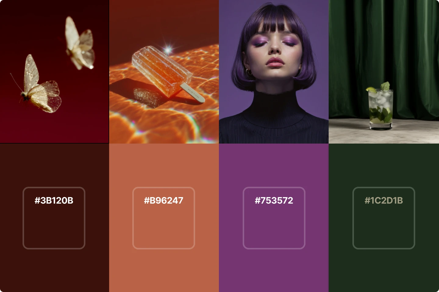
1. Midnight Frost
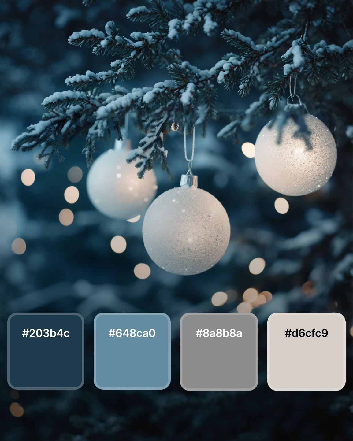
This palette comes from winter nights and frosted branches. The deep blue sets a quiet foundation. You use it when you want a focused and calm atmosphere.
The muted steel blue sits well with snowy textures and the two neutrals can provide balance to your designs. This is a great palette for you if you're working on winter campaigns, product launches with a cool tone, or any layout centered on reflective moments. Your visuals feel grounded because the colors work together without sharp contrast.
When you choose Midnight Frost, you give your projects a refined holiday tone.
2. Evergreen Luxe
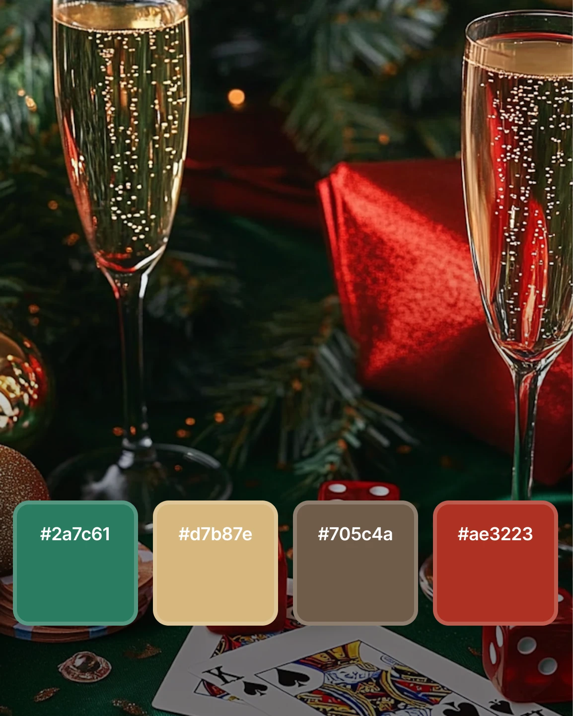
Evergreen Luxe blends rich green with gold, warm brown, and a muted red accent. You should use this color combo when you want traditional Christmas colors with more depth.
The green brings a natural foundation while the gold adds warmth to your compositions. The brown softens the palette and red offers a clear focal point.
This palette works for holiday menus, party invitations, seasonal ad campaigns, and gift-focused product photography.
Designers often reference why Christmas colors are red and green when building seasonal materials. Evergreen Luxe strengthens that tradition without relying only on those two colors.
Your audience sees something familiar, yet the palette provides enough variation for fresh styling.
3. Hearthside Warmth
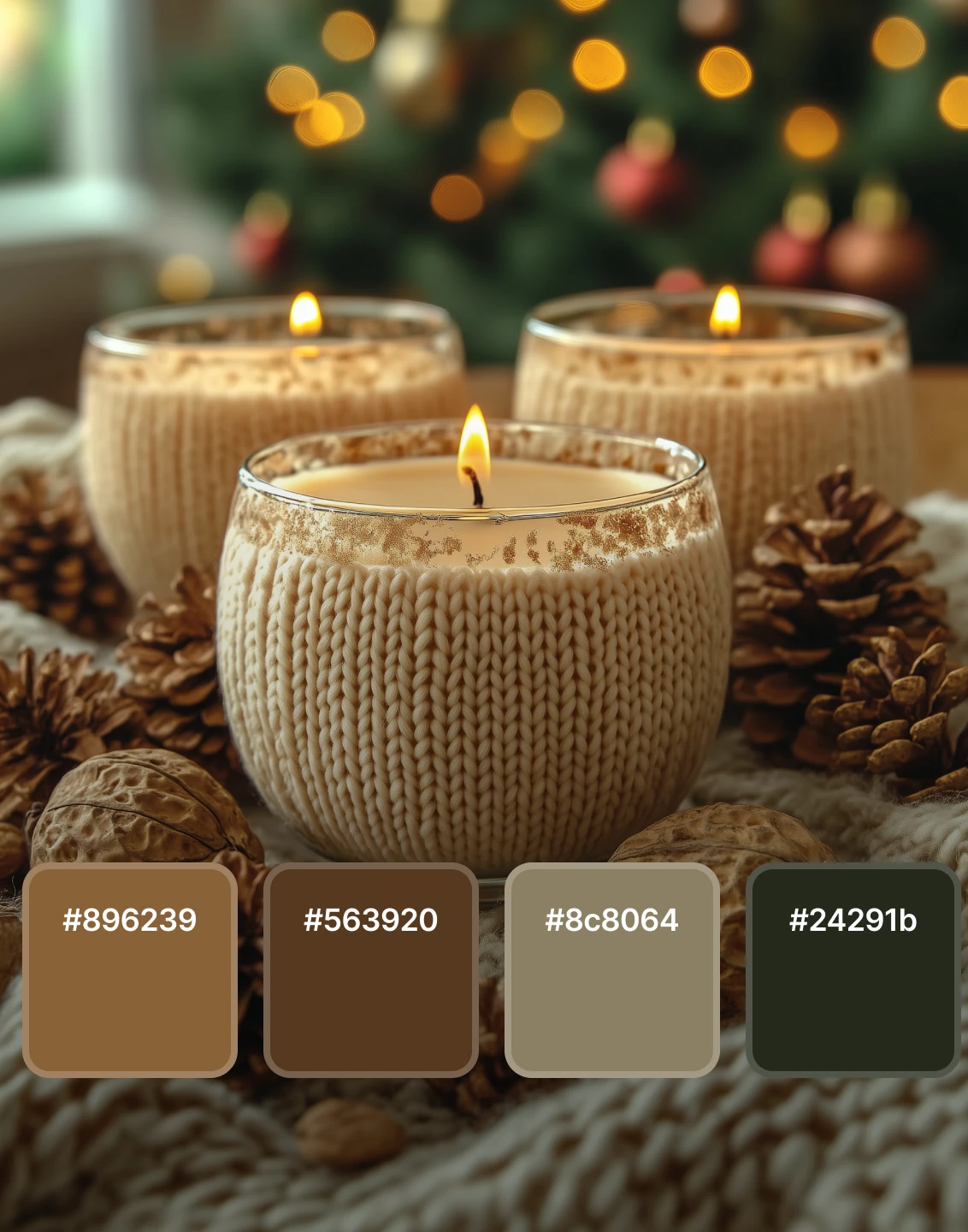
Hearthside Warmth focuses on comfort. You see these colors in candlelight, knitted fabrics, and rustic winter decor. The brown tones anchor your design.
The deep green acts as a subtle holiday reference, while the muted beige softens your layout. You should use this palette for cozy lifestyle imagery, home decor content, or brand assets that need an inviting atmosphere.
More designers are moving toward understated tones in holiday work. Audiences respond to visuals that feel grounded. Hearthside Warmth supports this shift.
You maintain a holiday identity without relying on bold saturation.
4. Classic Crimson Glam

Classic Crimson Glam presents a confident take on timeless holiday design. The deep red becomes the anchor behind the other colors, and are perfect when your project needs bold seasonal focus.
The earthy green and two warm neutrals support the red without competing with it. Many designers associate Christmas colors with red and green, and this palette stays close to that tradition while providing a more elegant direction.
You can use this palette for beauty campaigns, holiday gifting collections, or brand imagery that relies on bold seasonal identity.
5. Winter Citrus Cheer
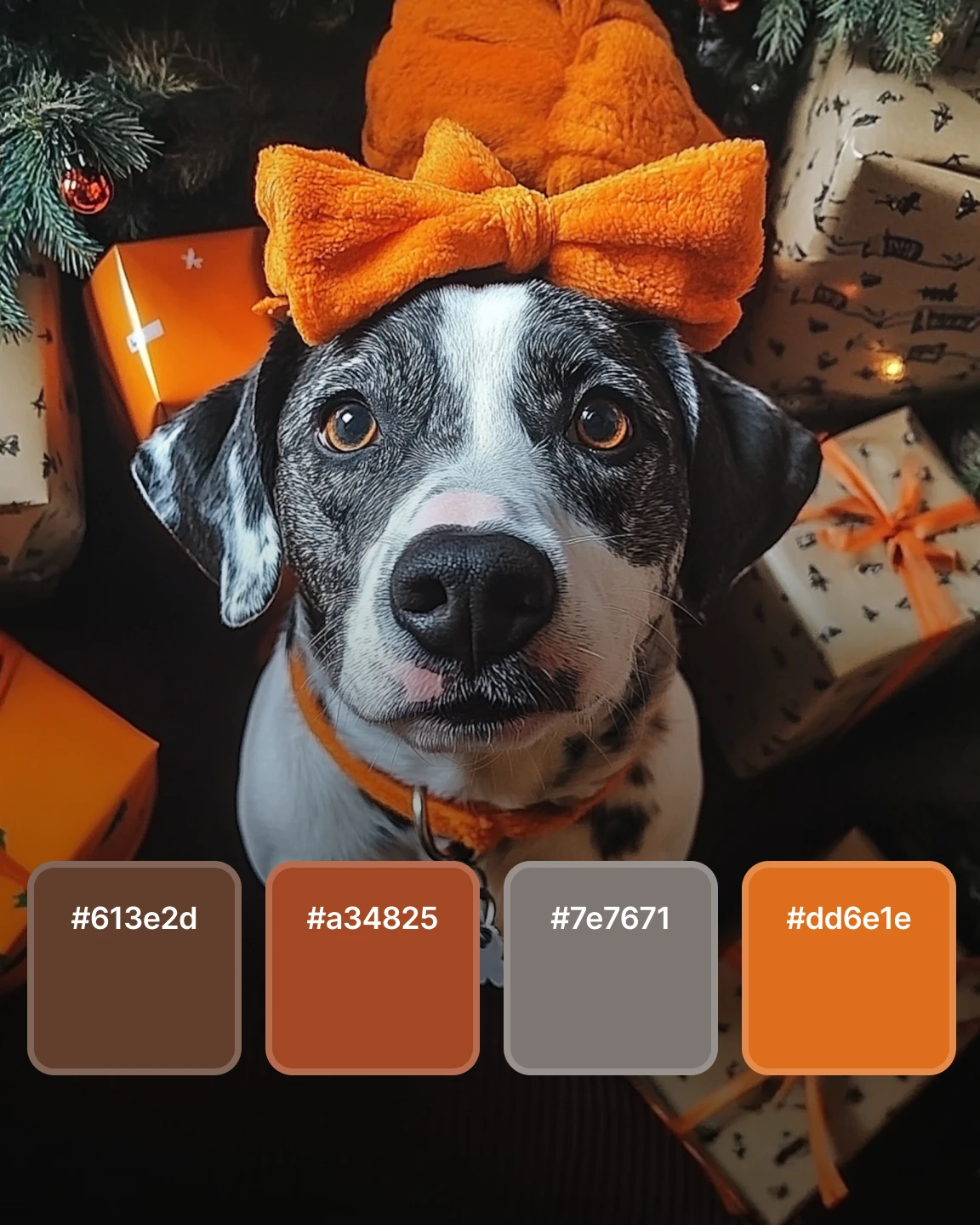
Winter Citrus Cheer moves into brighter territory. Orange has become more common in holiday visuals and designers are using it to shift away from traditional palettes without losing seasonal energy.
The warm brown grounds the composition as the muted gray balances the brightness. The two orange tones give your work character so you should consider this palette for playful campaigns, pet-themed imagery, greeting cards, or youth-focused branding.
This palette signals a broader color trend for 2026. Designers are using unexpected accents to refresh Christmas colors.
When you explore why Christmas colors are red and green, you see tradition, but you also see opportunities to introduce alternatives. Winter Citrus Cheer works for those moments.
Get festive and creative with Christmas colors
Color influences every part of your holiday design, and the palette you choose gives your work direction from the start. Once you decide what Christmas colors support your message, your visuals feel clearer and more intentional.
Your palette helps you sort out typography, lighting, and subject matter. Each choice lines up with the tone you want to express. Red and green feel traditional. Cool blues feel calm. Browns and neutrals feel warm. Bright accents feel playful.
These five palettes give you several paths to explore for 2025. You choose the one that fits your goal. As you build your holiday designs, use Christmas colors to set your foundation. Your palette shapes the mood, and your decisions bring the final image together.
Want to stay ahead of the creative curve? These are the most important design skills you'll need in 2026.
10 graphic design trends for 2026