Cool Lummi creations we saw in January


Here are a few of our favorite creations we saw in the first month of 2026.
January is often a quieter month for launches, but that calm tends to surface something more interesting: thoughtful design work. Without the pressure to chase trends or ship fast, creators lean into clarity, restraint, and solid fundamentals. That is exactly what we saw across the Lummi community this January.
The projects highlighted below are not loud or over-designed. Instead, they show confidence through structure, hierarchy, and intentional visual choices. Lummi imagery plays a supporting role in each one, strengthening the message rather than competing with it.
This post highlights a few standout creations from January, focusing on why the design works, not just what it looks like. We will keep creator context simple, then dig into layout decisions, typography, composition, and overall execution.
The importance of the creative community
Strong design does not happen in isolation. It is shaped by shared standards, feedback, and communities that value quality over speed. The Lummi community consistently reflects this mindset.
What stands out most is not a specific aesthetic, but a shared respect for fundamentals. Creators use Lummi visuals in very different ways, yet the outcomes feel cohesive because they are grounded in clear hierarchy, balanced layouts, and intentional pacing.
January’s projects are a good reminder that good design does not need to be flashy. When visuals, typography, and structure work together, the result feels confident and memorable without trying too hard.
Standout creations in January
There were tons of amazing designs and projects that creators published this month. These are a few that stood out.
Faris
Who they are:
Faris is a product and web designer focused on AI and SaaS, and a Framer Partner. Their work emphasizes clarity, brand systems, and strong visual foundations.
Why we love it:
Faris’s AXON landing page stands out for its control. The halftone-style imagery immediately adds texture and character, but it never overwhelms the layout. That balance is hard to achieve, especially with visually dense treatments.
The hierarchy is clear from the first glance. The headline is given space to breathe, supporting copy is easy to scan, and navigation elements stay out of the way. Even with a bold visual treatment, the page remains readable and calm.
Color usage is restrained and cohesive. Warm tones are layered thoughtfully, creating depth without visual noise. Typography stays simple and confident, grounding the more experimental imagery.
This project is a strong example of how Lummi visuals can add personality while still respecting structure and usability.
Marto
Who they are:
Marto is a web designer and developer, and a Framer expert working with brands and freelance clients.
Why we love it:
Marto’s hero section immediately establishes focus through composition. The glowing doorway acts as a natural focal point, while generous negative space creates a sense of calm and confidence.
The layout excels at spatial hierarchy. Elements are positioned deliberately, guiding the eye from headline to supporting copy without friction. Nothing feels crowded or unnecessary.
Typography does a lot of quiet work here. Emphasis is created through spacing and scale rather than decorative choices, which keeps the design feeling timeless. Color gradients add atmosphere, but never distract from the message.
Lummi imagery integrates seamlessly into the environment, reinforcing mood while maintaining clarity. The result feels immersive without sacrificing usability.
Dave Omeiza
Who they are:
Dave Omeiza is a product designer and Framer developer focused on building and launching digital products.
Why we love it:
Dave’s eCommerce concept stands out for its clarity. The hero image is strong and emotive, but the layout ensures the product message comes first.
Content layering is handled with care. Text overlays remain readable, interface elements are clearly defined, and nothing feels placed arbitrarily. The hierarchy makes it easy to understand what matters most on the page.
Typography supports usability without drawing attention to itself. Buttons are easy to identify, copy is concise, and spacing keeps everything legible.
Lummi imagery helps elevate the perceived quality of the brand while staying aligned with functional design goals. This project shows how visuals can enhance trust when paired with disciplined layout decisions.
Frederik
Who they are:
Frederik is a Framer expert focused on building tools and experiences that help creators design, build, and ship faster.
Why we love it:
Frederik’s editorial-style layout is driven by structure. A clear grid system and strong typographic hierarchy create a smooth reading experience from start to finish.
Images are used intentionally, breaking up content without disrupting flow. Motion and energy come from the visuals themselves, while the layout stays calm and consistent.
Typography carries most of the weight here. Headings, body copy, and spacing work together to create rhythm and clarity. Color usage is minimal, allowing form and movement to take center stage.
This project highlights how Lummi visuals can support content-heavy layouts, not just landing pages, when paired with strong editorial design principles.
Create something people remember with Lummi
What connects all of these projects is not a shared style, but a shared approach. Clear hierarchy. Intentional composition. Respect for the user’s attention.
Lummi works best when visuals are treated as part of a system, not a shortcut. When paired with strong design fundamentals, they elevate the entire experience and help ideas come through with confidence.
January’s creations show that memorable design is rarely about doing more. It is about making better decisions. Thoughtful layouts. Clear typography. Visuals that support the message.
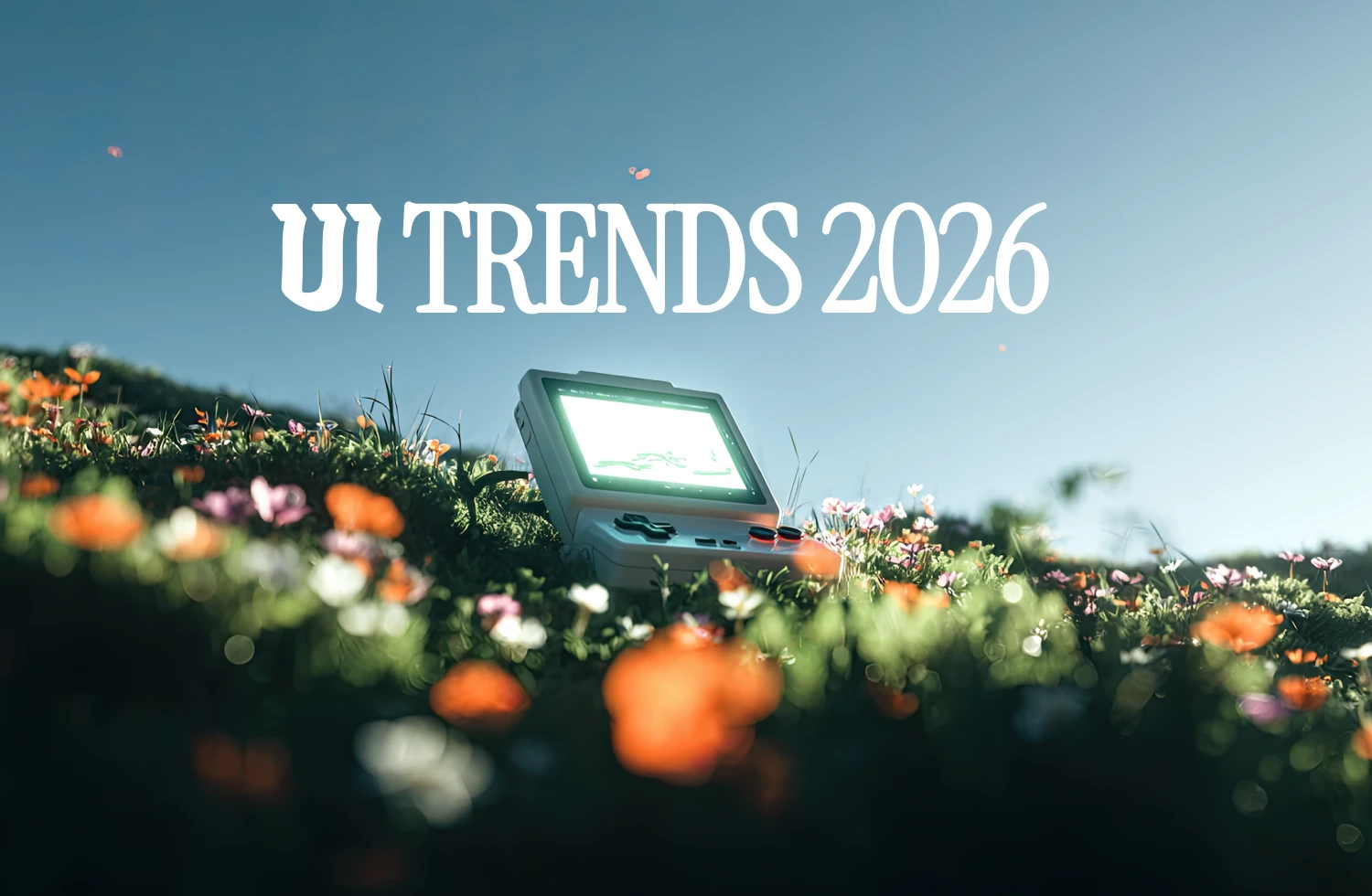
UI trends you will likely see in 2026