Graphic design news: what's hot right now in 2025

Here is the latest news from the graphic design world, focusing on branding, industry changes, and the styles that are dominating the visual world as of right now.
Visual and graphic design trends shift fast, and you feel that pressure every time you open a design tool. You want your work to look current and feel sharp. You want your visuals to match what people expect to see right now. Trends do not replace your style, but they guide your choices. They shape the way audiences respond to your work.
And as we approach the new year, design trends are taking shape in 2026. Platforms are rewarding bold visuals, brands are refreshing their look more often, and creative teams test new styles daily. If you want your work to stay relevant, you need to know what people respond to today. These five visual styles show up everywhere. They influence campaigns, product pages, social posts, and brand refreshes. You can use them without changing who you are as a designer.
To keep your work current and in line with what’s trending right now, we compiled five trends that are dominating the visual world right now.
The importance of staying current on visual trends
Staying current helps you grow as a designer because you pick up new techniques, sharpen your instincts, and get a better feel for what works in different situations. People move fast and make quick judgments, so fresh visuals help you hold their attention.
Keeping up with trends also strengthens the way you communicate. You speak to your audience through styles they already understand, which removes friction and makes your ideas easier to follow. Trends give you direction when you feel stuck, and they help you make faster choices about layout, type, and what trending colors to use.
You do not need to follow every trend or change your style all the time. You only need awareness and to choose what fits your message and what supports your brand.
Clients and teams expect designers to stay informed, so understanding current styles shows confidence and helps you share ideas with more clarity. You stay flexible, and your workflow feels easier.
Exploring trends also keeps your work moving forward. You build versatility, avoid repetition, and develop a stronger eye for detail. You understand what people notice and how they respond to specific cues, which helps you make more intentional decisions.
The five visual styles that are dominating design right now
We dove into the latest trends on social media and listened to what creative taste makers are saying about design.
Here’s what you can expect to see a lot of over the next few months.
1. Y2K alt zine
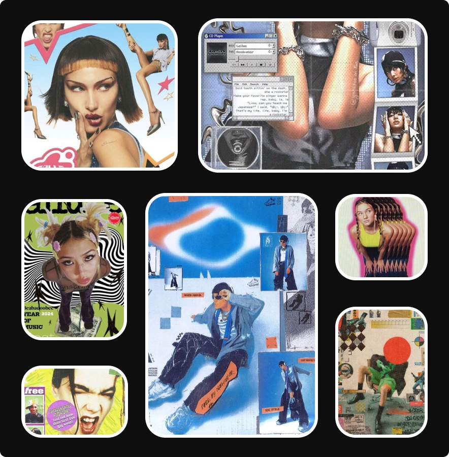
This style pulls from early internet textures mixed with handmade zine culture. You see bold headlines, low-res graphics, rough edges, scratchy overlays, and compressed colors. It feels both loud and personal.
You’ll notice the influence of scanned paper, photocopied collage, and chunky type. This look gives your work a raw quality without polished gloss.
You add value when you use this visual approach for music content, youth-focused brands, personal storytelling, and editorial layouts.
To use this style well, start with rough textures, bold type, and mix photo cutouts with stickers or scribbles. Keep your color choices simple. If you add too many tones, your layout feels heavy. Focus on contrast and structure.
2. CRT effect

This style mirrors the glow and distortion seen on old screens, and designers are building the look with soft blur, RGB shift, scan lines, and curved distortion on frames. The result draws attention fast because the effect feels familiar to anyone who grew up with early screens.
Viewers respond to this style when you want them to feel tension, nostalgia, or tech-forward themes. You should use this effect to frame your key message and to sharpen a focal point in your project.
Another tip you should consider is when you apply it, stay subtle. If you push the distortion too far, you lose clarity. Start with gentle shifts in color, then add light lines or noise if needed. Test the brightness. If your design looks washed out, raise contrast to regain balance.
3. Catalogue core

This style uses clean columns, cropped product shots, minimal type, and structured layouts. It feels like old mail-order catalogues with sharper lines and intentional framing. You see it in fashion lookbooks, product highlight pages, and minimal brand content. The focus sits on the object, leaving the viewer to be undistracted.
To use this style, start with a simple grid. Add one clear headline, and place your object in the center or slightly offset. Keep your background neutral.
The strength of this style comes from precision. You give the viewer one place to rest their eyes and reduce visual clutter. This style works well when you want to highlight a product feature, a new release, or a collection. It helps your reader feel clarity and order.
4. Graffiti pop

This style merges bold street art with bright flat color, so expect to see chunky outlines, marker streaks, bubble lettering, and paint textures. It brings energy to brand content, event marketing, and youth-focused campaigns. This style is great when you want to speak to your audience with confidence.
To work with graffiti pop, pick two or three bold colors. Use thick outlines. Add simple shapes that feel spontaneous. Balance your layout with empty space to avoid overwhelming the viewer.
This style works best when your message needs direct and expressive visuals. It works well on posters, album art, and limited edition packaging. This style requires strong choices, so be bold when you dive into graffiti pop.
5. Frutiger aero
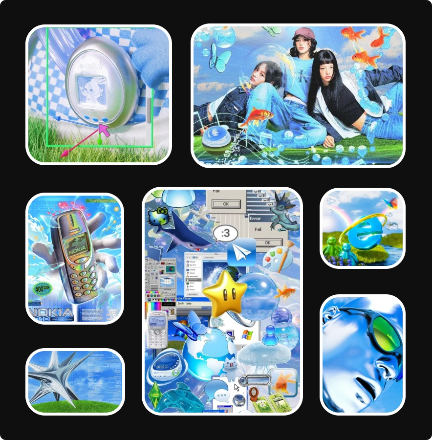
This style mixes shiny plastic textures with electric blues, floating bubbles, chrome surfaces, and cartoon-simple 3D icons. It feels playful and ultra-digital, almost like early 2000s tech ads mixed with game menus. You see bright skies, soft clouds, liquid shapes, sparkly highlights, and smooth reflections that make every element feel polished and inflated.
You’ll notice oversized interface icons, emoji-like symbols, tiny creatures, and friendly objects that hover in space. The style leans on nostalgia for early mobile phones, glossy OS graphics, and kid-friendly product design, but with a cleaner and more intentional finish.
To use this style well, start with bright blues and whites. Add shiny gradients, bubble gloss, and rounded 3D objects that feel soft to the touch. Mix simple UI elements with playful digital icons. Bring in clean skies, sparkles, or underwater-like highlights to create depth. Keep shapes smooth, lighting bright, and textures glossy so the entire layout feels cheerful and digital without drifting into clutter.
Use Lummi to create stunning visuals
You stay current by learning fast, and you do that by testing ideas instead of waiting for inspiration to show up. Lummi makes that process easier because you get a quick way to explore new visual directions without spending hours building assets from scratch. With the Lummi image generator, you enter your prompt, adjust your description, and refine your idea until the visuals match what you had in mind, making it the perfect design tool to test visual trends.
Lummi also supports your work by removing friction and makes iterating on creativity easy and quick. When you feel unsure about a new style, you can generate multiple versions and test your visual direction. You adjust structure, test color, explore lighting, and you'll find that each version brings you closer to the direction you want.
Your audience rewards clarity and freshness, and your teams and colleagues expects a strong visual point of view. Or if you’re a designer with clients, they’ll expect design that performs. Being the driven creative that you are, you need to meet those expectations.
Want to stay even further ahead of the creative curve? These are the most important design skills you'll need in 2026.
How to create stunning AI product photo shoots

